2024 德國 iF Design Award
Residential:In the trail of light

2023 臺灣 金邸獎 TINTA (Taiwan Interior New Talent Award)
居住空間|單層|優勝獎:In the trail of light
靈感起源 Design Statement
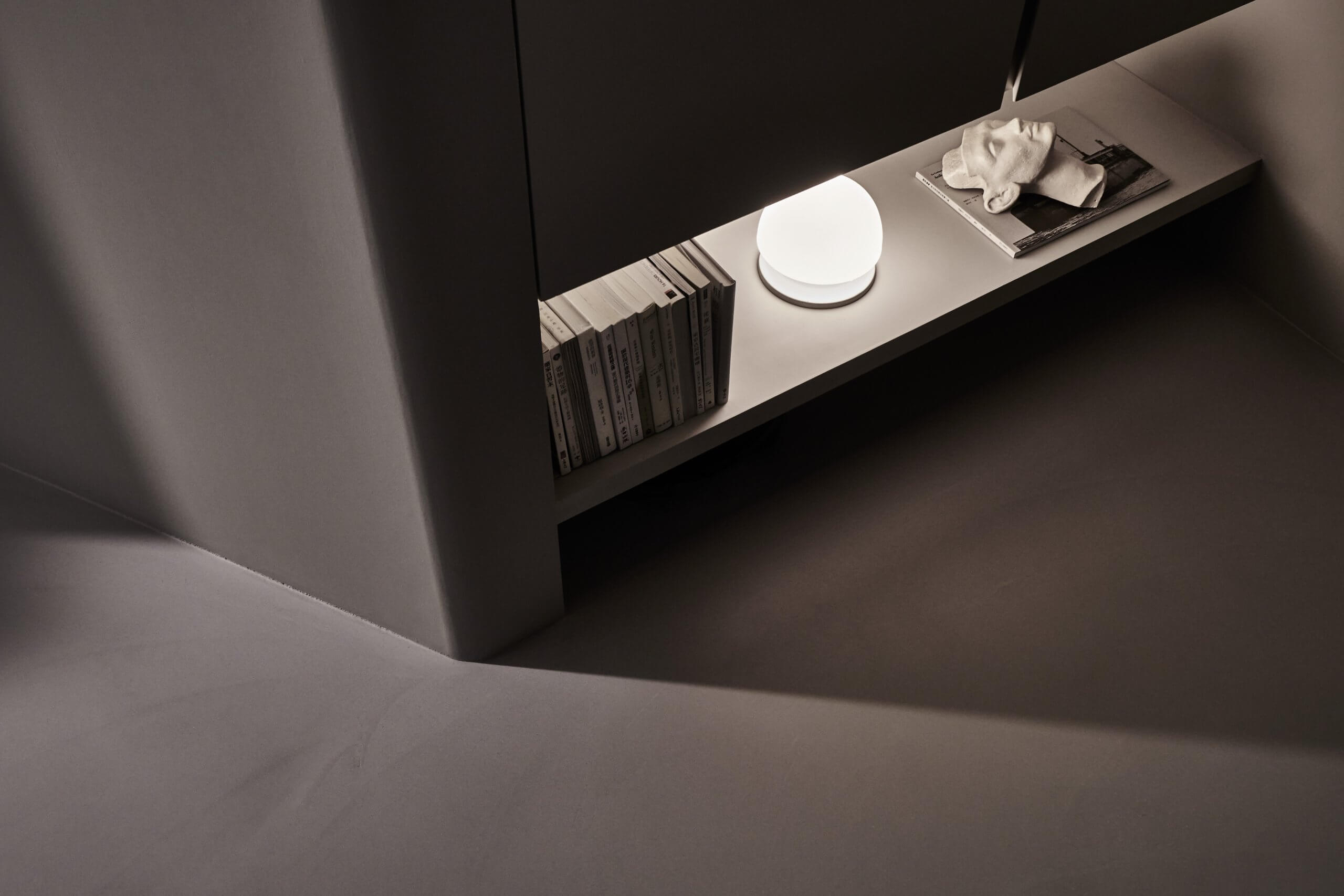
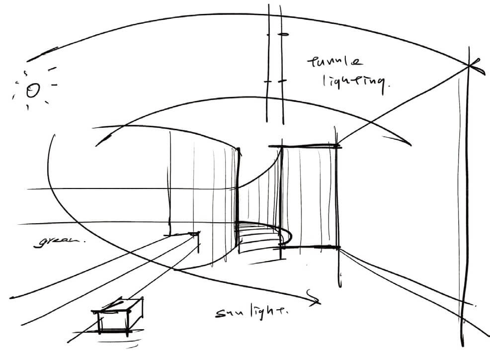
光是本案設計重點,透過創造明暗變化,試圖於空間重塑卡拉瓦喬筆下《聖馬太蒙召》所呈現光之啟發性,使人隨著光而移動之間,獲得內在的撫慰。
Light being the key of this project begets gradations of brightness and darkness. We hope to create lighting that is as inspiring as the light in Caravaggio’s The Calling of St. Matthew.
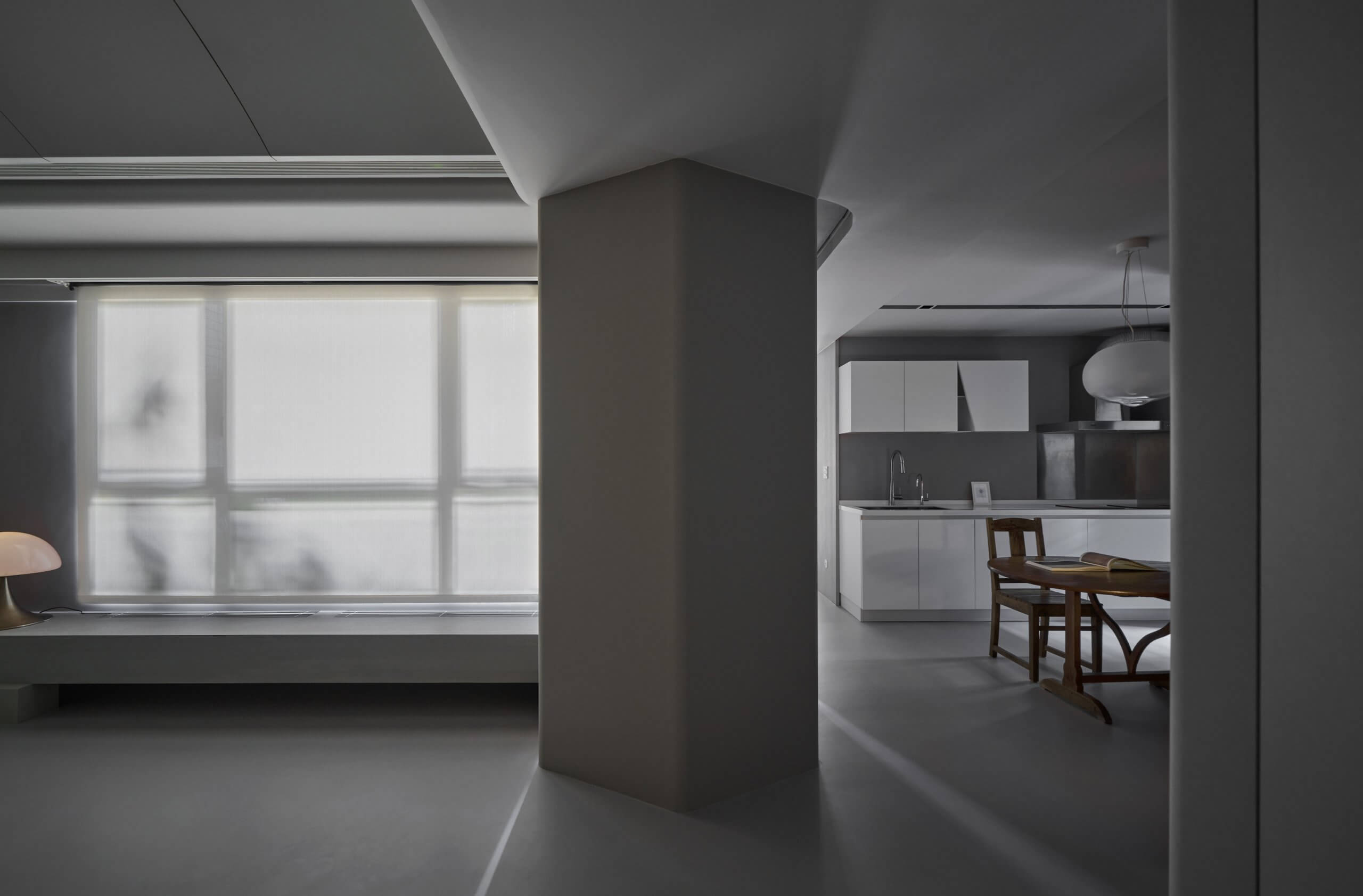
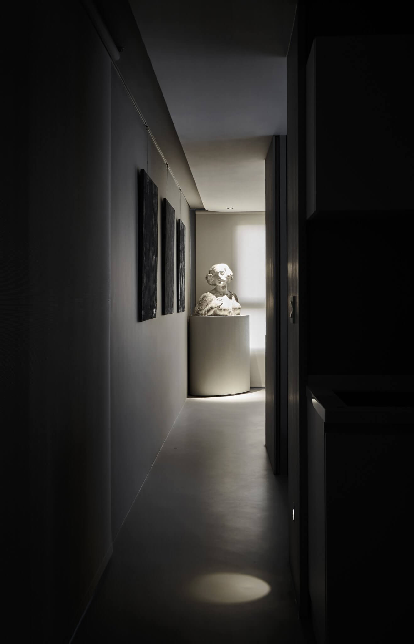
順應L形基地及單面採光不足條件,以雕塑的方式削減、集中、增加或延伸光線,由入口處弱光照映植栽倒影,打造暮靄沉沉的忘塵感,轉折點設置幽微人造光,銜接敞亮的主要活動區域,最後依循間隙光駐足於臥室藝廊,以期產生感性領悟。
Given the L-shaped base and insufficient natural lighting, we sculpt the light to boost, lengthen, merge or taper its influx. Faint lighting is used at the entrance for plant reflections to create a sense of otherworldly low-hanging detachment. Opaque lighting is applied at the nooks that lead to the bright activity area. Before reaching the bedroom, one follows the light to linger in the corridor of art, a space where epiphanies will hopefully occur.
設計概念 Conception
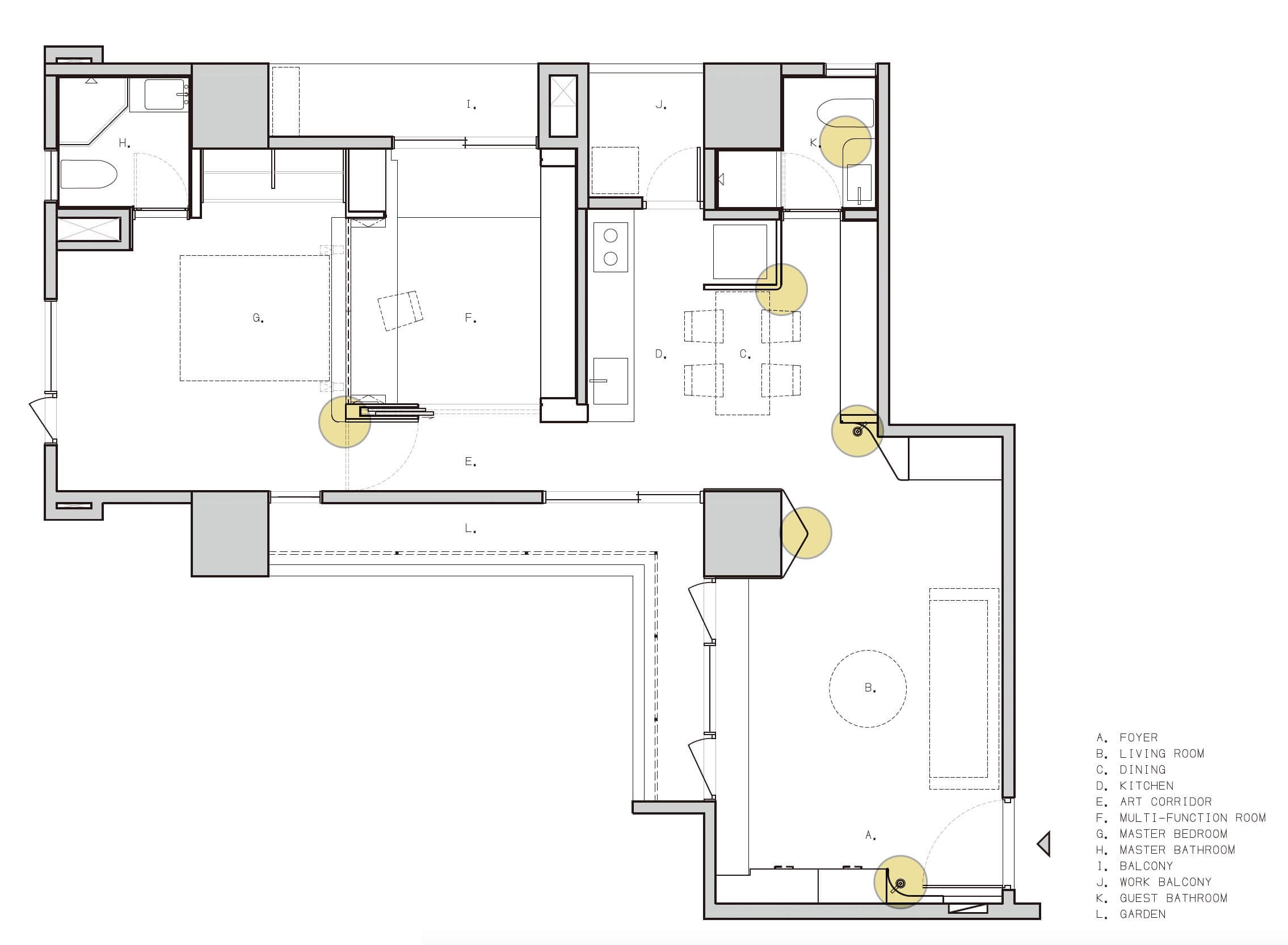
設計師憑格局規劃刻意強調L型地坪,功能依附走道發展後讓出完整路徑,並由硬體結構控制光線位置層次,人可以從光線得到路線的明確暗示,走動過程可以感受空間表情的起承轉合,享受基地形狀帶來的樂趣。
The L floor shape of the space is accentuated, its corridor the basis for the layout and the light positioning guided by the inherent spatial structure, which prescribes where to walk and where to turn. Walking through the space, one will sense the spatial expressions in their varied terrains of pleasure brought by the shape of the base.
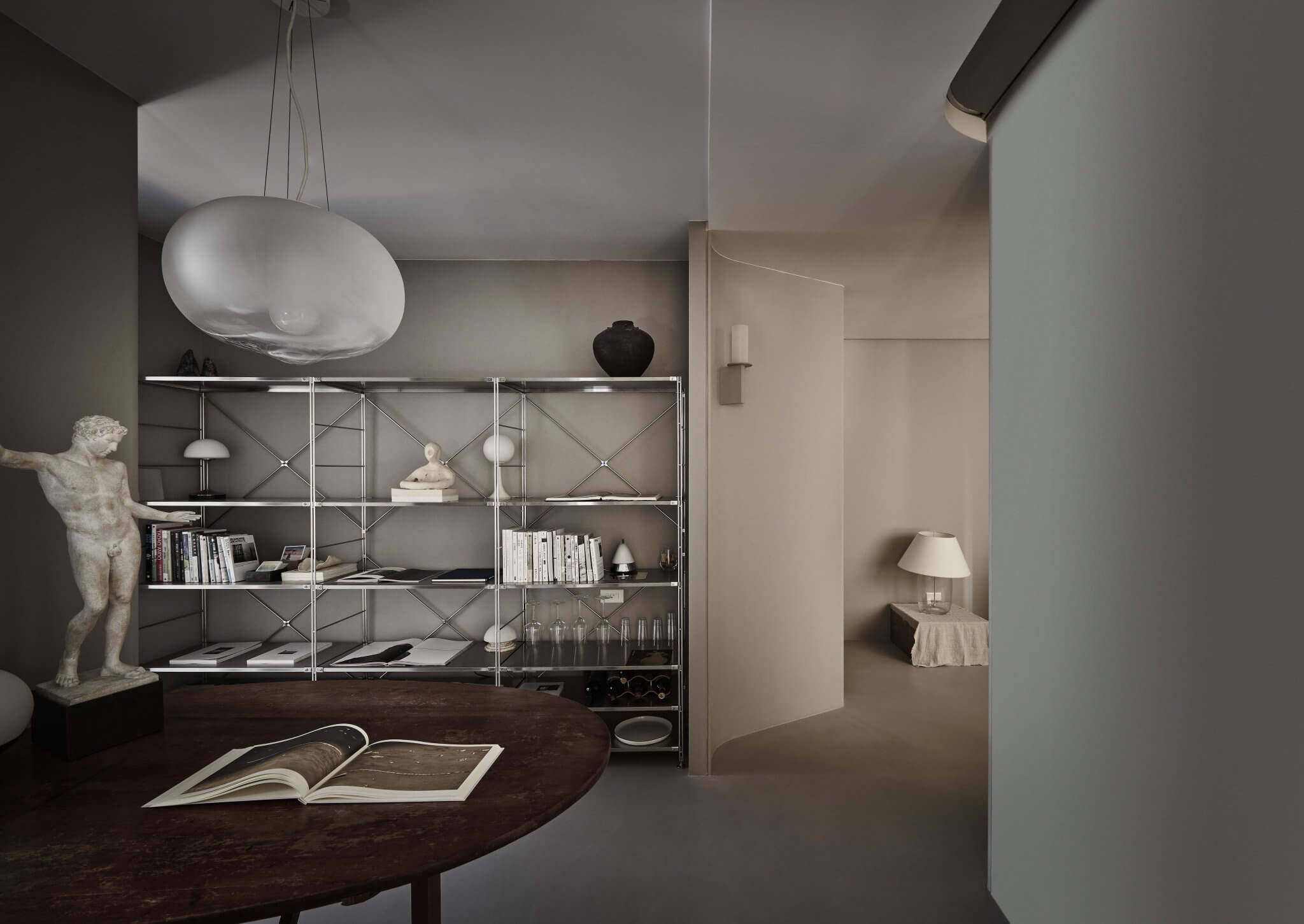
形式層面根據業主的收藏興趣,為使住宅與人相容,因此延續粗獷主義精神,空間成為背景乘載生活變化,意即誠實地面對結構、屏棄額外修飾並突顯材料的真實感。
The client’s collections determine the form of the design. For the residence to blend with its dwellers, we extend the ethos of Brutalism in which space as a backdrop allows life to unfold. We turn to the structure with honesty, discard excess decoration and highlight the authenticity of the materials.
設計形式與功能 Forms & Functions
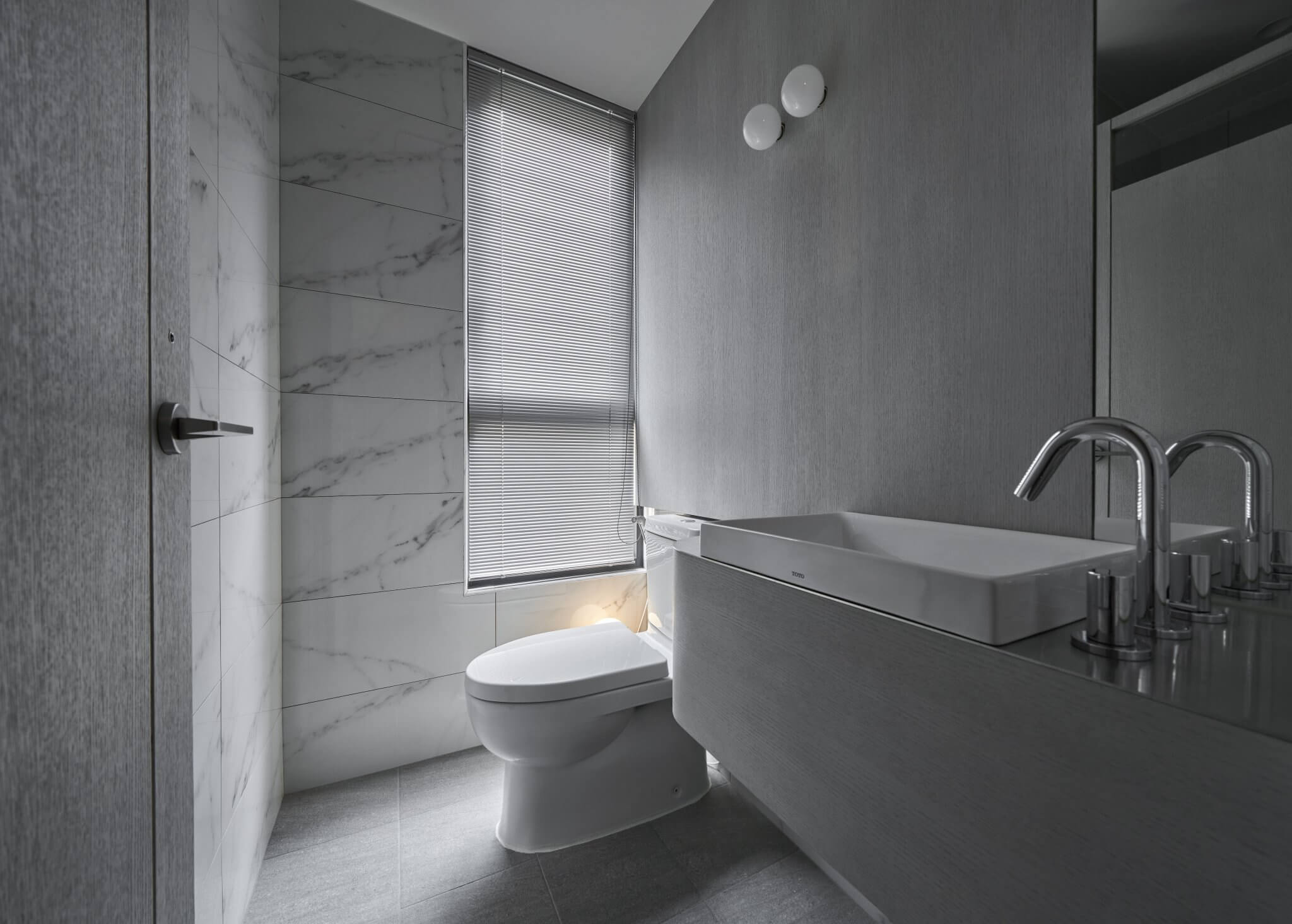
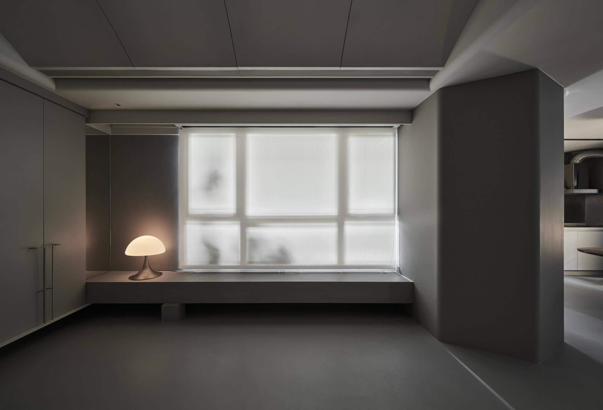
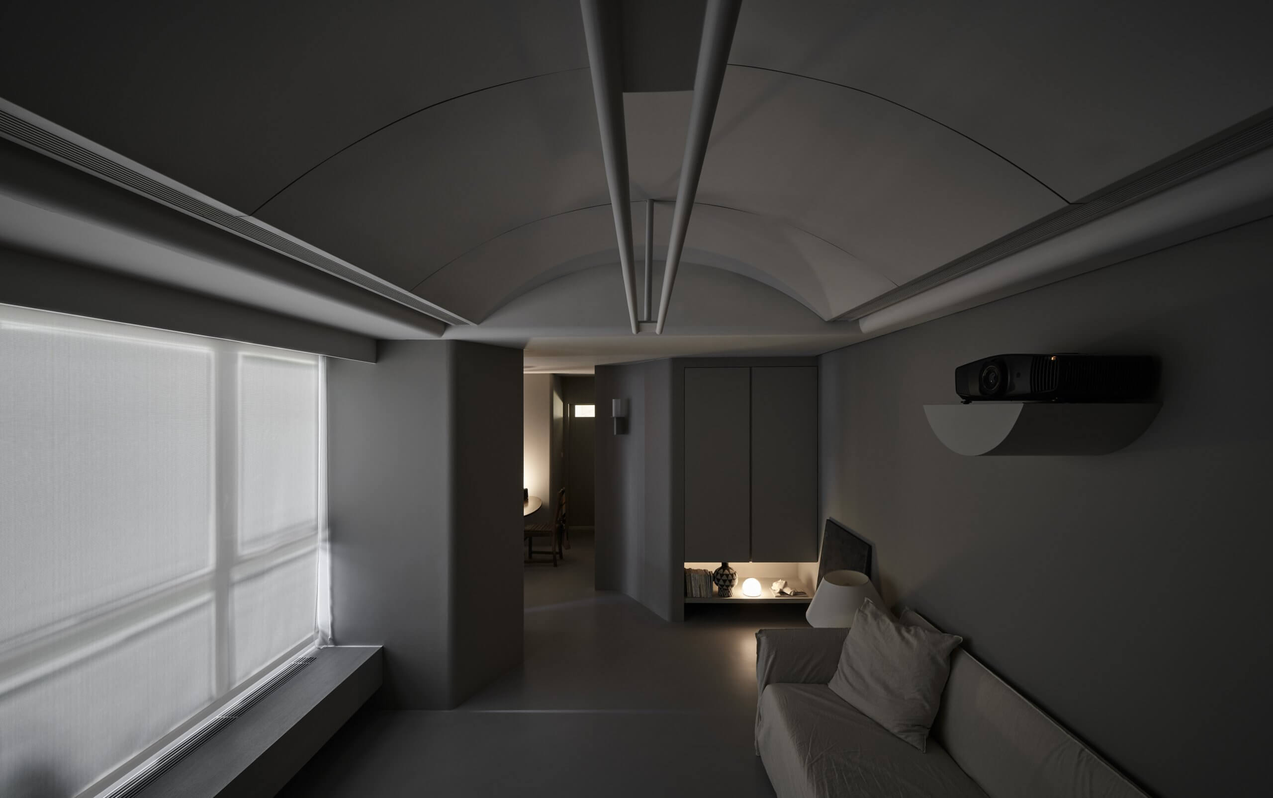
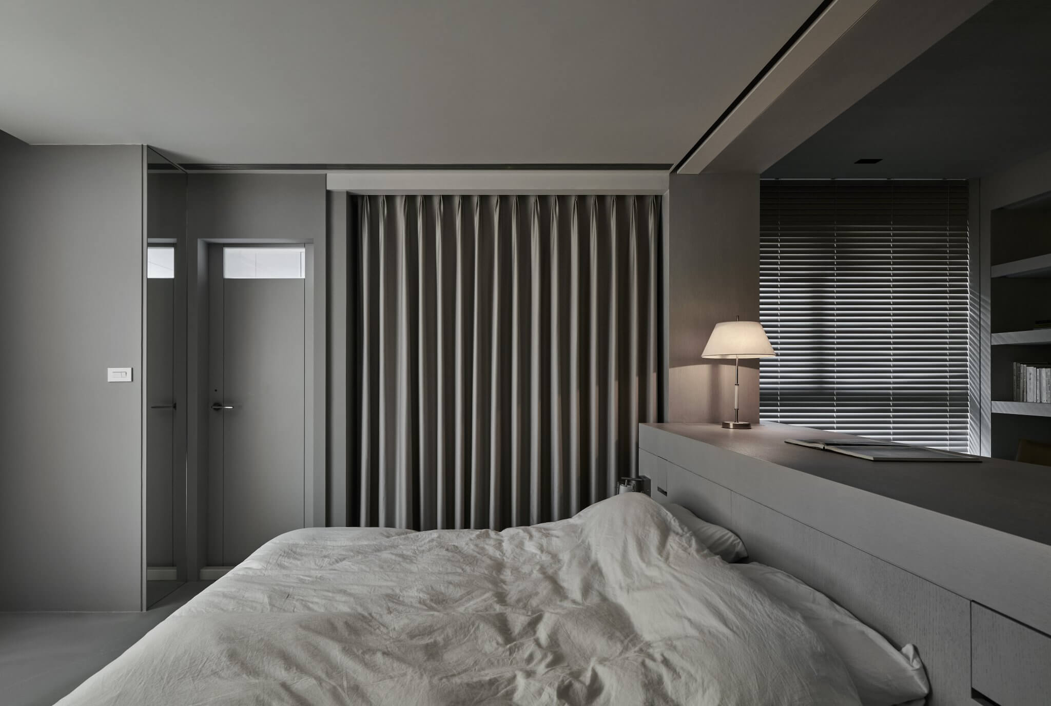
無強烈色彩、也無繁複線條,全屋基調停留於淺灰色階,由細微明度差異展現微量層次,保持整體色彩的均勻平衡,局部搭配銀色金屬材料,藉其伴隨高反光特性而來的輕透感,襯托無彩度灰色的內斂沈穩。線條則盡可能地收攏,採量體化表現方式,與部分細緻五金軟裝,形成厚實及透薄的對比,彰顯主體粗壯的比例。客廳的弧型天花則模擬隧道造型,明確路徑方向,亦為空間的起點,向內部注入流動感。
Minus sharp colors or complex lines, the entire residence is kept in a greyscale with slightly varied brightness to show gradations to retain an overall balanced color scheme. Silver metals are used in localized areas, with their high reflectiveness to emit radiance and heighten the grounded mellow achromatic grey. Lines are reined in and expressed in volumes to form a solid yet clear contrast with delicate furnishing and highlight the ratio of the coarse main structure. The arched ceiling in the lounge is a tunnel simulation to give clear directions and mark a starting point in space into which a sense of flow can be injected.
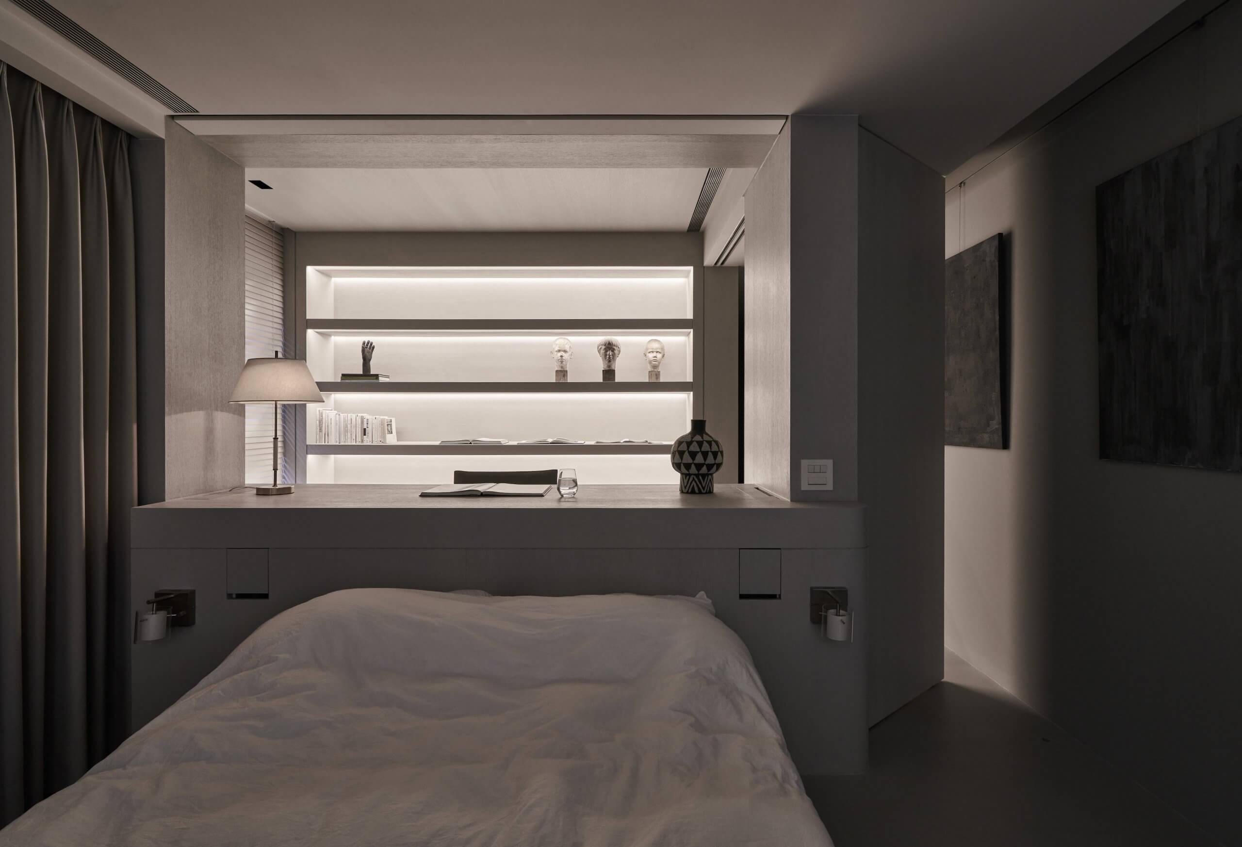
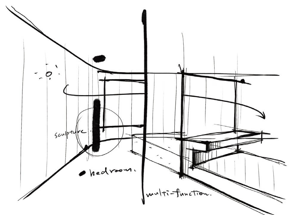
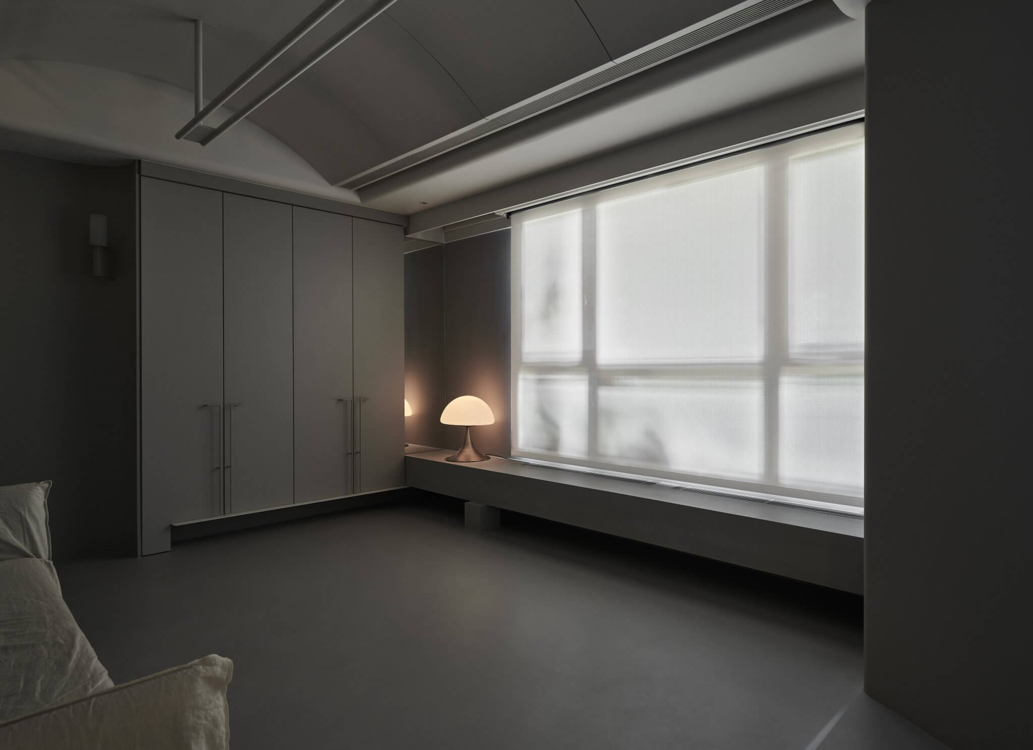
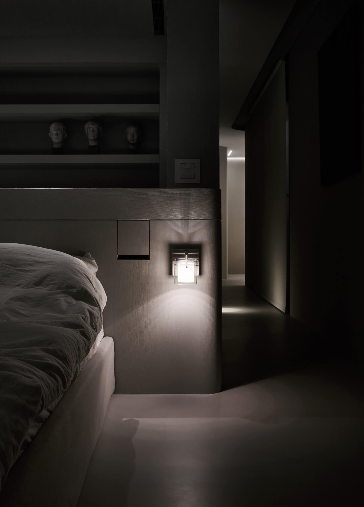
為提高小空間的坪效,把機能打散再結合,使單一物件滿足複數的機能需求,例如書桌延伸成為床頭櫃,臥室門也是書房門,植栽窗景兼具視頻投影和書架功能。
For optimal use of small spaces, we shake up the definitions before merging the functions for single pieces to serve multiple purposes. The desk doubles as a headboard; the bedroom door also a study door; the windowsill also an AV projection display or a book stand.
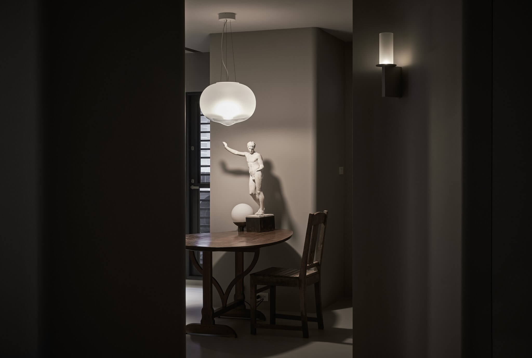
通過計算和創造角度控制光線照射面積,演繹區域彼此曖昧不明的視覺關係,建立虛擬距離尺度,而燈具結合邊鏡,也營造對實際錯亂的空間延伸感。門片與隔屏的彈性運作,確保光能無礙穿透,同時有不明場域界定的意味。
We vary the incoming sunlight by precise calculation and controlled angling to create virtual distances and effect an opaque visibility amid different spaces. Lighting devices along with side mirrors create a simulated spatial extension beyond the actual boundaries. The flexible use of door slides and screens ensures unhindered light influx while blurring the spherical confines.
